
ui/ux Design
You know that feeling when a website just makes sense and you find what you need without thinking? That’s what I design. Your visitors glide through, nobody gets lost, and your site feels as good to use as it looks.
A name that carries an  old storydesign
 that carries a clear point.

btw I’m left handed
ResumeHi, I’m Parth. I design clean, easy-to-use websites and app interfaces that help businesses of all sizes turn visitors into customers. With 1 to 3 years of hands-on experience in UI/UX design, I focus on making every page simple to navigate and good to look at. I start by listening to your goals, then design with a clear purpose behind every choice. Outside of work, you’ll usually find me with flip book, pencil and messy hair.
B.Tech in Electronics and
Communication Engineering
From University of Kalyani,
Kolkata, India


You know that feeling when a website just makes sense and you find what you need without thinking? That’s what I design. Your visitors glide through, nobody gets lost, and your site feels as good to use as it looks.
Scrolling is fast, but a good post makes people slow down for a second. I design posts that feel fresh and familiar at once, so your feed looks like one happy brand and people start recognising you before they read your name.

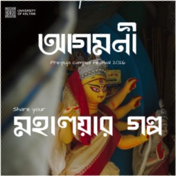


Remember the posters that made you stop and look? Let’s make one of those. Bold, clear, and easy to take in at a glance, so people feel the message before they’ve finished reading it.

Your logo is the first hello your business says, and it
keeps saying it everywhere. I’ll shape a mark that
feels like you, looks sharp on a signboard or a tiny
profile picture, and makes people smile when they spot
it.
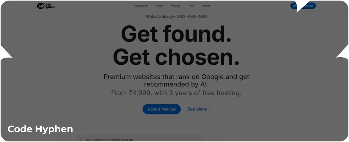
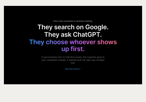
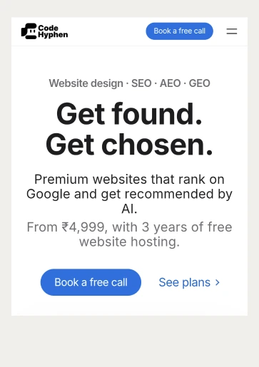
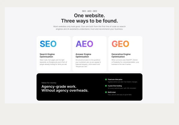
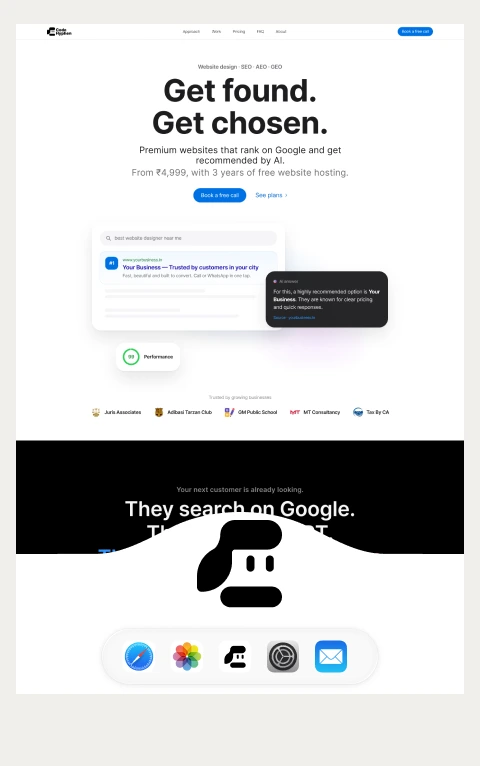
I designed the website for Code Hyphen, where
businesses can pick a website package and get started.
2026
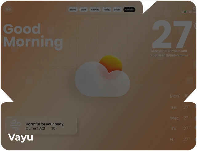
Live weather, a weekly forecast, and a
sensor that finds local hot spots.
2025
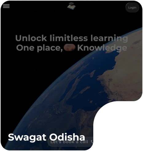
A website for an educational institute,
designed to make admissions simple.
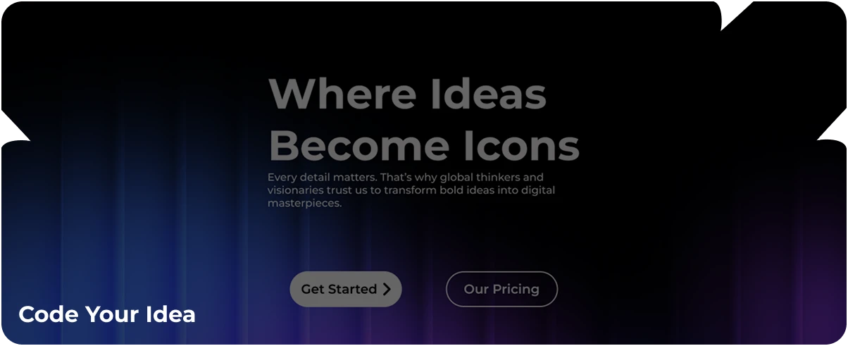
A redesigned website for a team that builds premium
websites and apps, as polished as the work they deliver.
2024
Website development
When I first designed the Code Hyphen website, one thing stood out: they care about making websites that look premium and still feel fair to the client. A brand should say that before anyone reads a word. So I built an identity that is clean, confident, and warm, a look that feels premium without feeling out of reach.
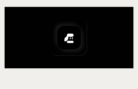
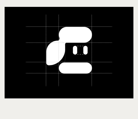

Stands for Code, the first half of the brand name, and gives the mark its main silhouette. The smooth, flowing curve feels friendly and premium, so it avoids the stiff, cold look many tech brands have. The wide top bar and the curve on the left create a sense of movement, like a page being turned.

I turn the mark into a character, which gives the brand a personality people can remember. They also look like a screen or interface element, a quiet reminder that Code Hyphen builds for the web. Sitting inside the open space of the “C,” I feel like someone looking out at the client, curious and attentive.

It’s the literal hyphen from the name, placed as the base that holds the whole mark together. It doubles as the mouth, so one simple shape carries both the name and the expression. Its wide, calm shape acts like a connector between the idea (design) and the build (code).
I chose Inter because it fits what Code Hyphen sells: a premium look that still feels fair. It’s clean and modern, stays readable on every screen, and its soft curves echo the rounded shapes in the logo. It’s also free and open source, so the client gets a professional font with no licensing cost.